top of page


2025-01-23
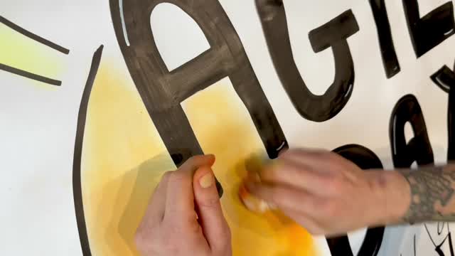
The Power of Shading in Visual Design
Little focus on the shading of big visuals. 🎨
The goal here was to “detach” the text from the background. To do that, I left some blank space between the shading and the black lettering. It creates a halo that gives more energy to the visual.
Also, the “uneven” aspect of the shading gives a more genuine look - aiming for perfection sometimes creates an artificial look that might remove a bit of the intent (also, it’s quite boring 😄)
Happy sketching to all the sketchnoters, visual facilitators orgraphic recorders in the room, and also to all those who just enjoy it 😊

8

0
View on


bottom of page